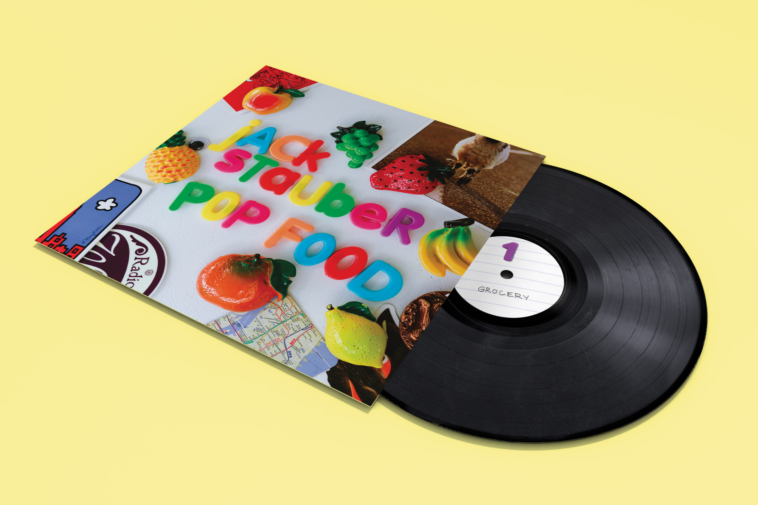
Album Design
Magnets and various other found objects, Canon Mark III, Colored PencilDecember, 2019
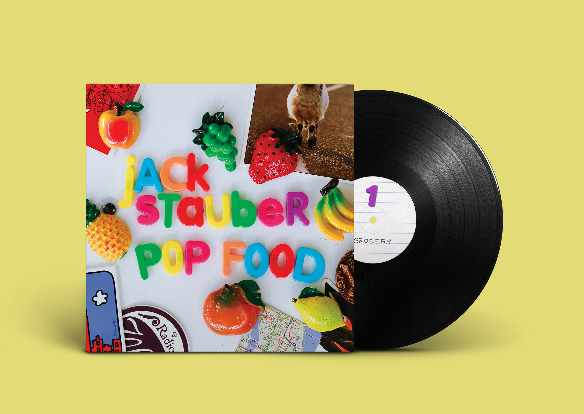
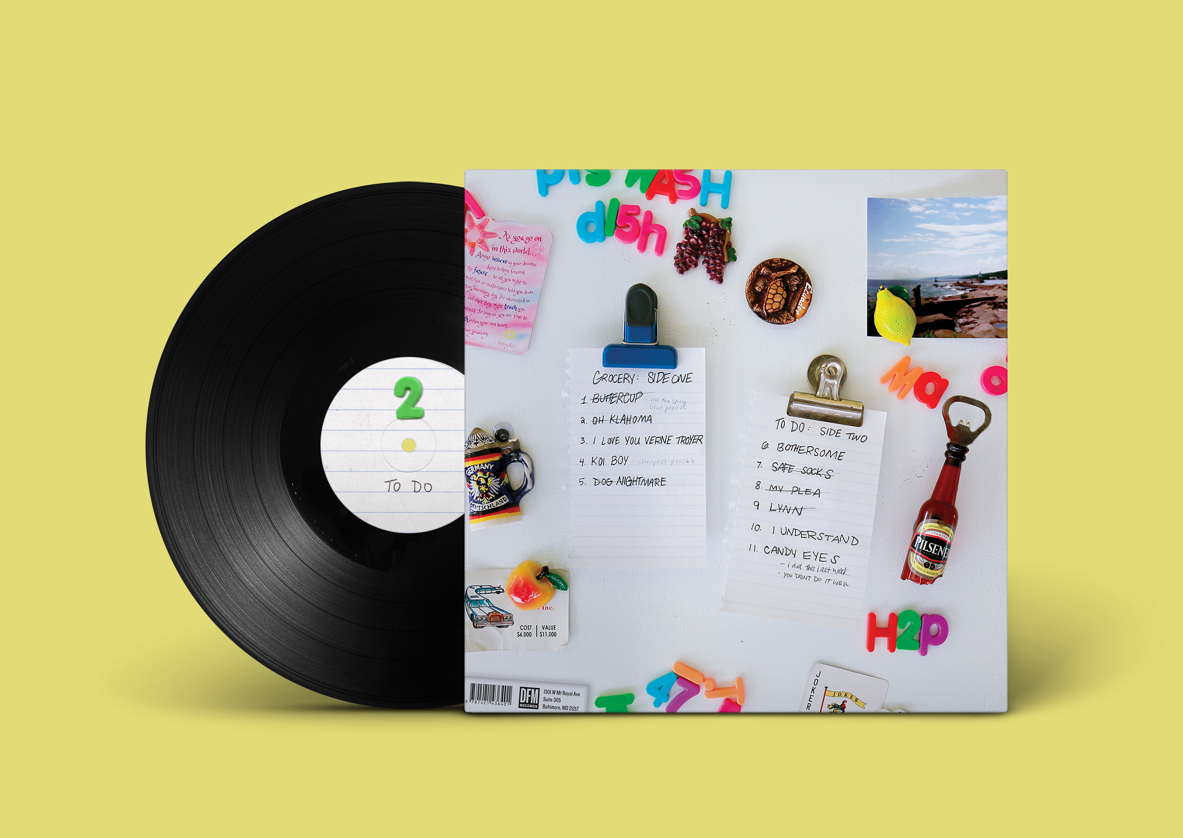
This album art redesign is for Jack Stauber’s Pop Food. His music has an innate physical nature to it and I wanted to show that scattered materiality within the album art. Using letter magnets and various other found magnets and objects, I shot the photos on my refridgerator with a Canon Mark III.
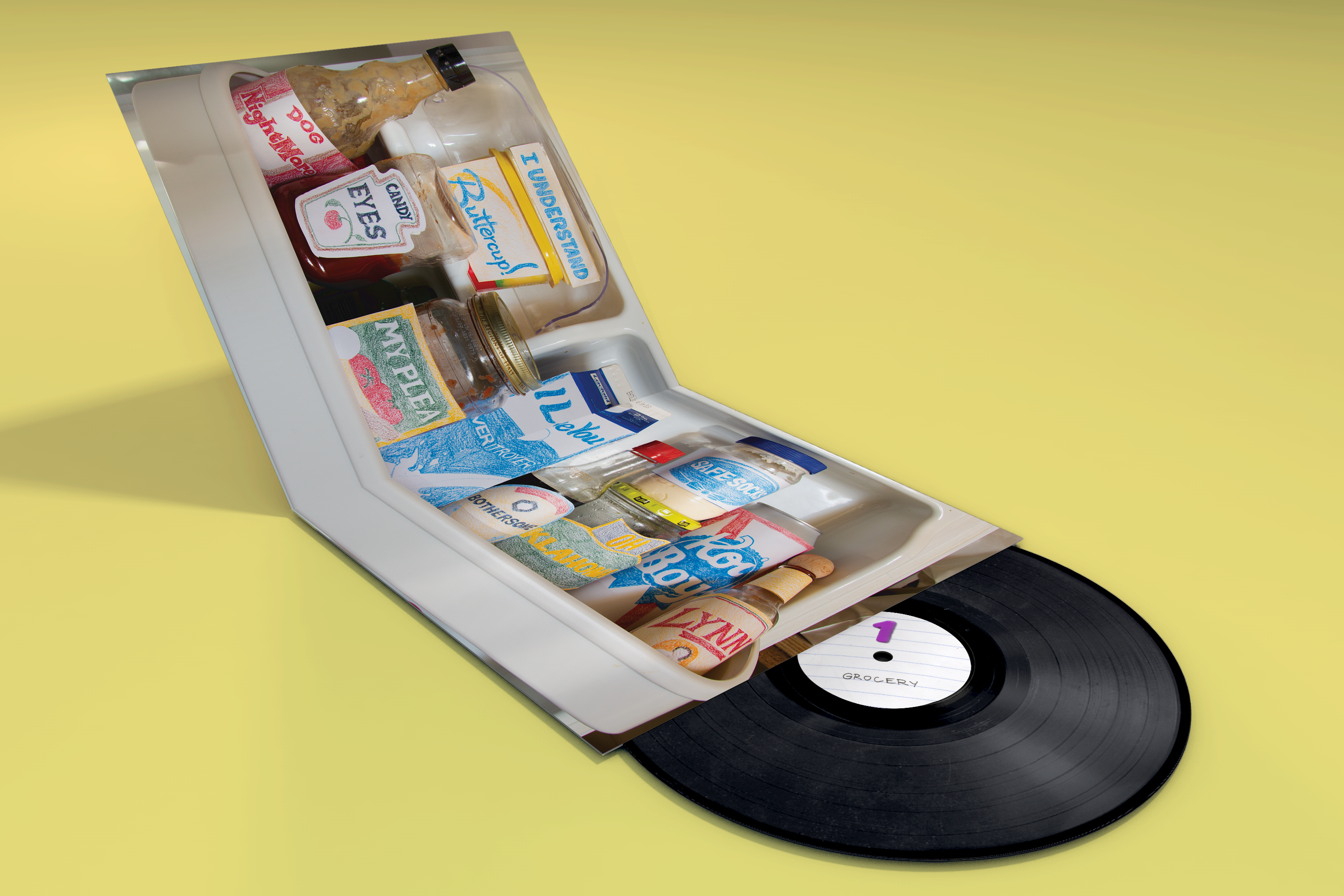
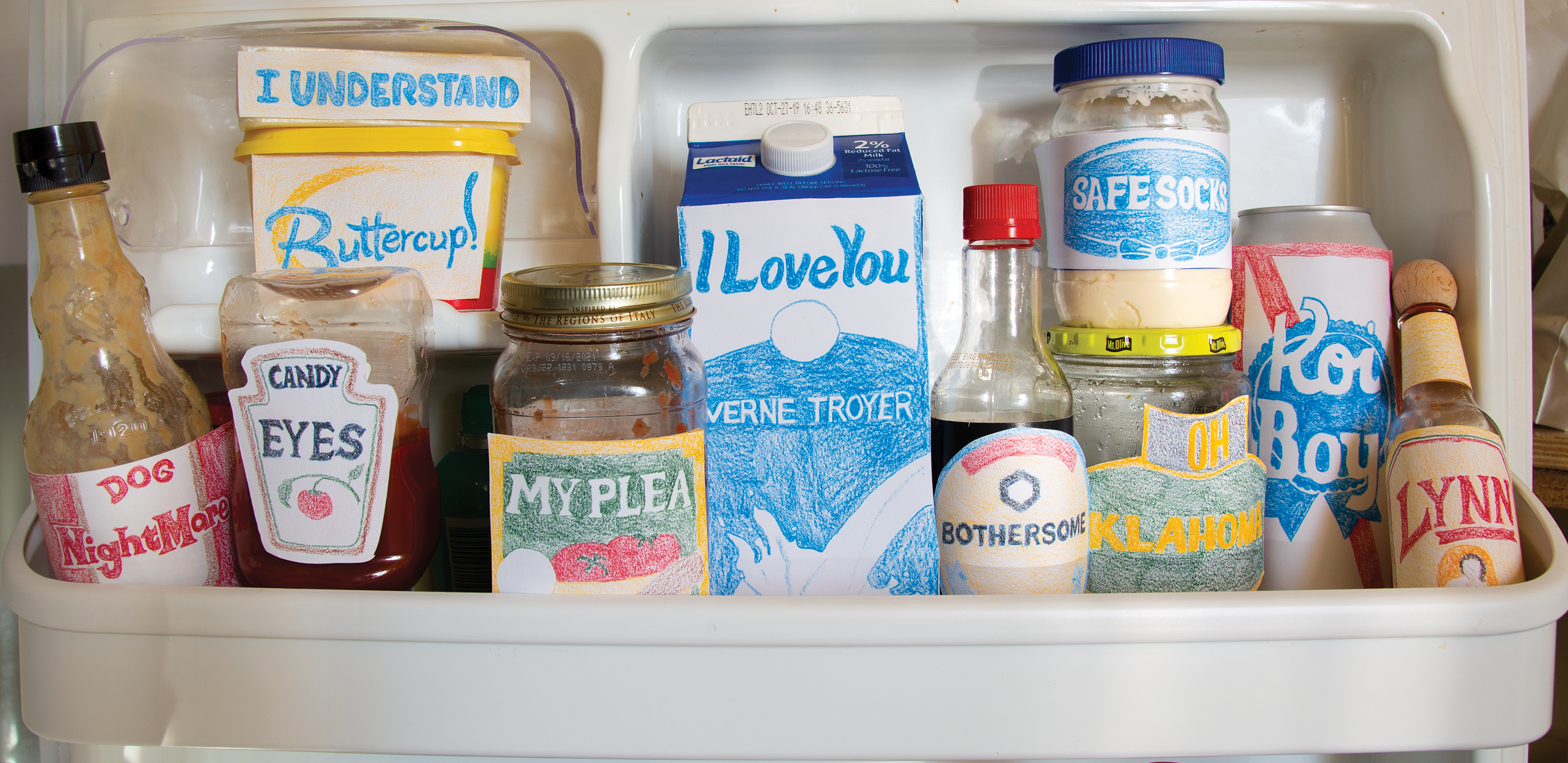
For the gatefold, I wanted to bring in an element of simplicity into the labels of the food items while incorporating the names of the songs. At first I was considering photoshopping the labels and printing them but it would be impractical and hard to pull off. Colored pencil felt like the right energy of playfulness and simplicity. I was inspired by the Felt Bodega installation by Lucy Sparrow.


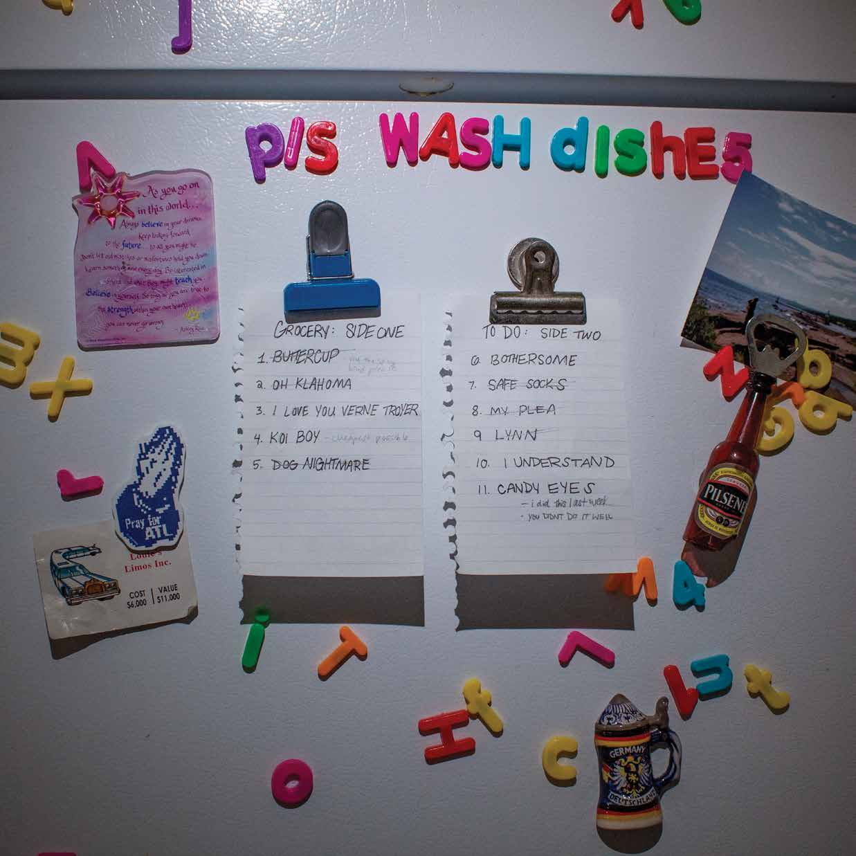
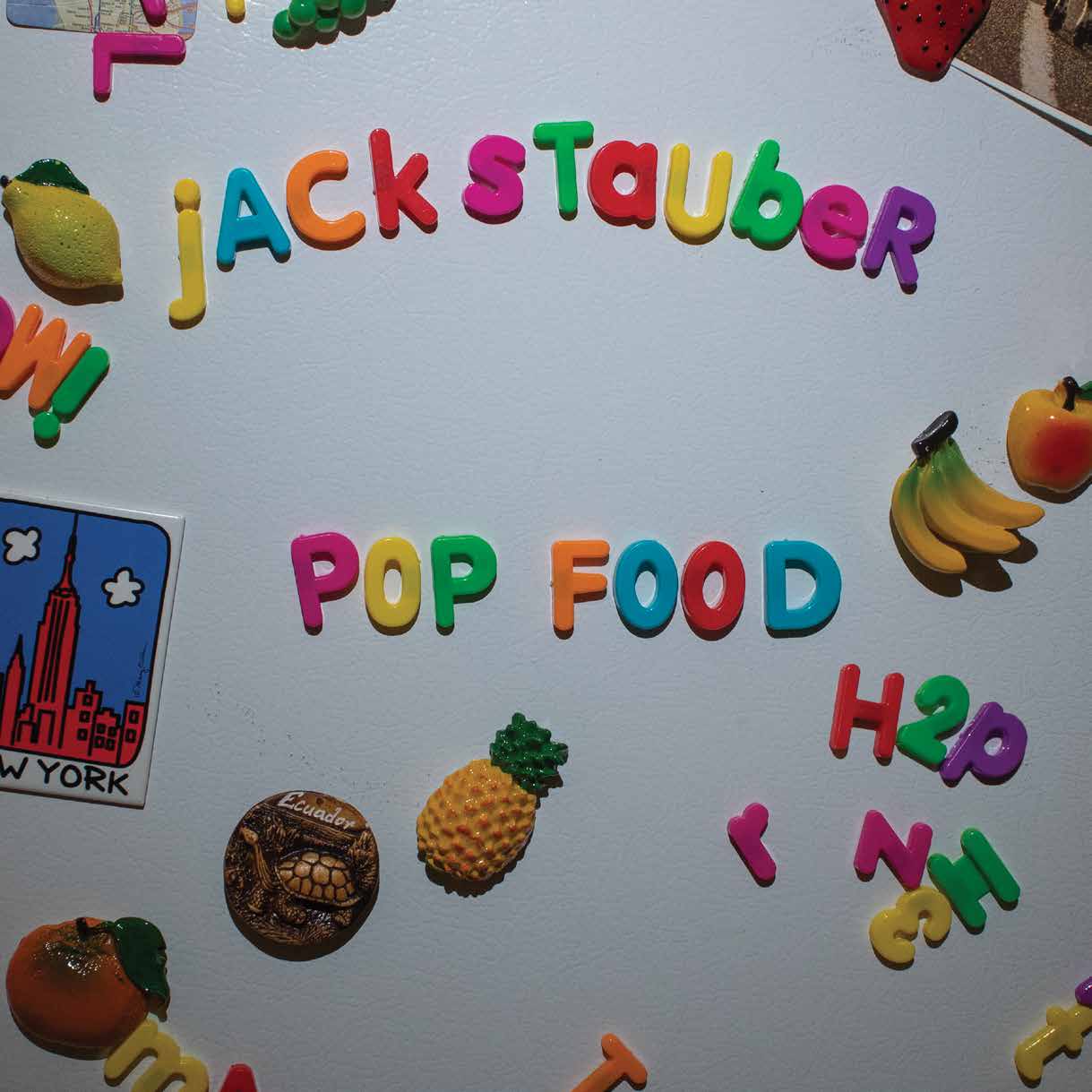
The first draft began with some preliminary shots using an LED lighting rig. I tried multiple set ups and lighting, but the lighting felt too artificial and melodramatic with the shadows cast. From there, I decided that the natural
light was sufficient. The beginning also felt too far away without enough focus set on the letter magnets. Then, the crowded nature was working, but the other magnets and elements were drawing too much attention away from what was important.
light was sufficient. The beginning also felt too far away without enough focus set on the letter magnets. Then, the crowded nature was working, but the other magnets and elements were drawing too much attention away from what was important.
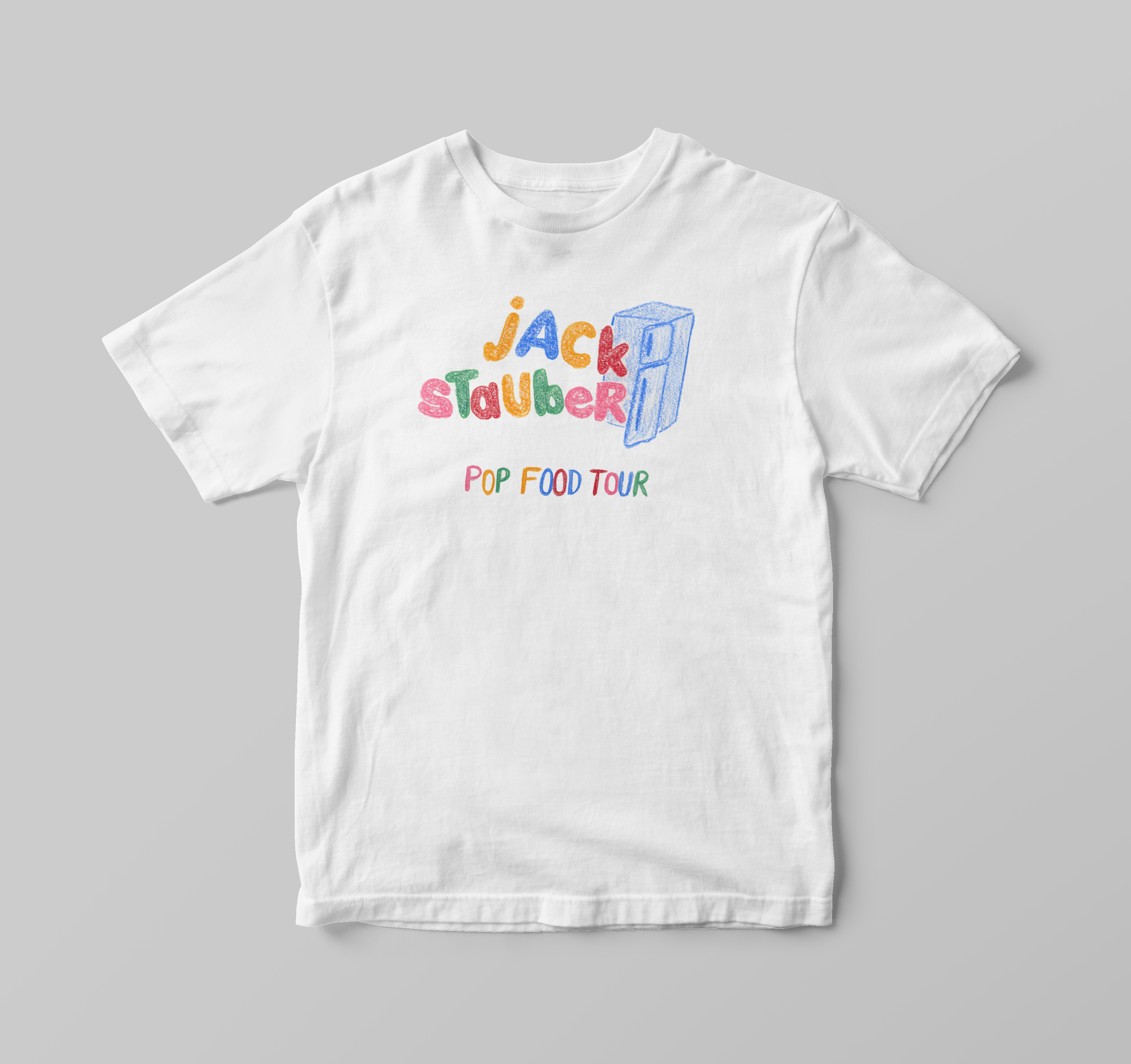

The tour shirts follow the same line as the gatefold with the playful colored pencil paired with a hand lettering that mimics the letter magnets.
